Telcor was watching the wrong numbers move: 57,000 sessions over 11 months, a 70% bounce rate, and visitors spending an average of 32 seconds before leaving. Mobile traffic sat at 19%, roughly half the benchmark for SaaS healthcare. Nothing was obviously broken. The site was leaking, quietly and structurally, at every stage of the journey.
The problem was not traffic. It was clarity at the moment it mattered. Telcor's site was drawing real volume, but visitors could not tell in the first few seconds what the product did, who it served, or how it differed from competitors like XIFIN, Quadax, and Siemens.
Four distinct buyers were landing on the same generic homepage: laboratory billing executives, CFOs, point-of-care coordinators, and lab directors, each looking for a different kind of proof, and none of them found a clear path. The interface looked dated next to competitors, calls to action read as generic as "Learn More," and the Contact page was converting at 2.68%, against a 10-20% B2B SaaS benchmark.
The work did not start with a redesign. It started with research: VOC quotes, GA4 numbers, competitor comparisons, and persona pain points, so that by the time wireframes were being drawn, every decision already had three or four pieces of evidence behind it.
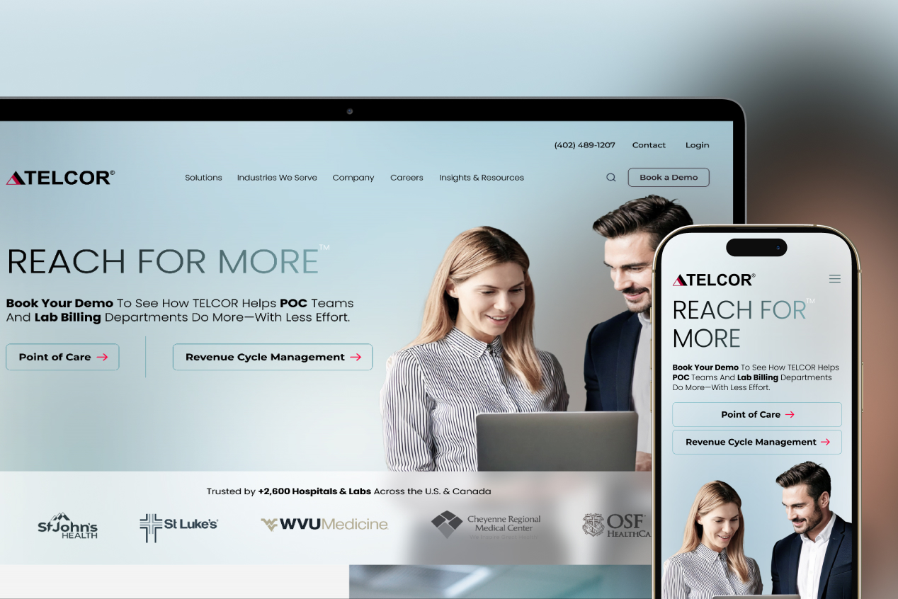
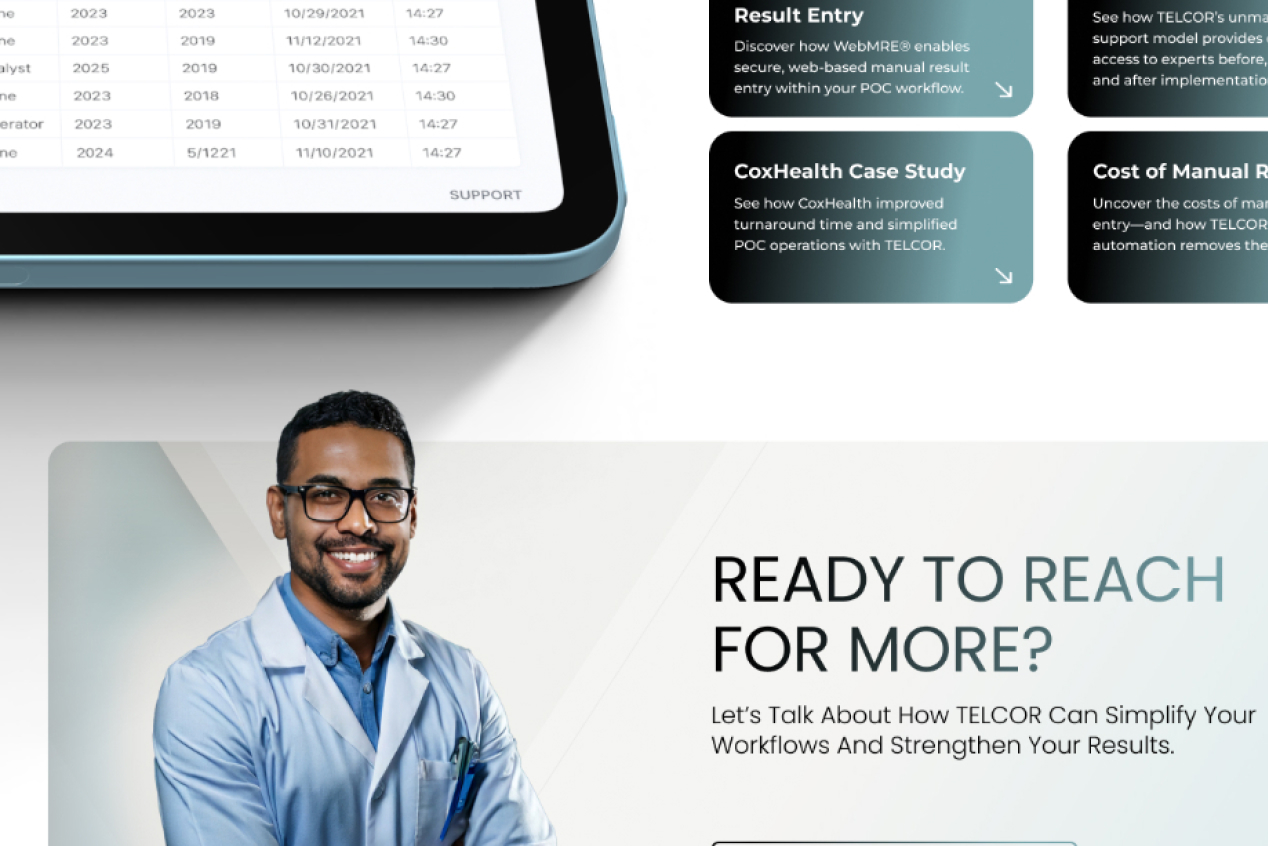
Six structural shifts followed, each defended by data. Above-the-fold copy was rewritten to state who Telcor is, what each product does, and which of the four personas it serves. Generic "Learn More" buttons became intent-driven CTAs like "See How We Boost Collections" and "Watch a 2-Minute Demo." Testimonials, client logos, and outcome stats, a 6-12% collections increase and 95% electronic payments, moved into hero sections instead of staying buried on interior pages. I also consolidated a sprawling seven-page Products menu into three clear Solutions, POC, RCM, and RCS, and added an Industries We Serve section so visitors could self-identify immediately.
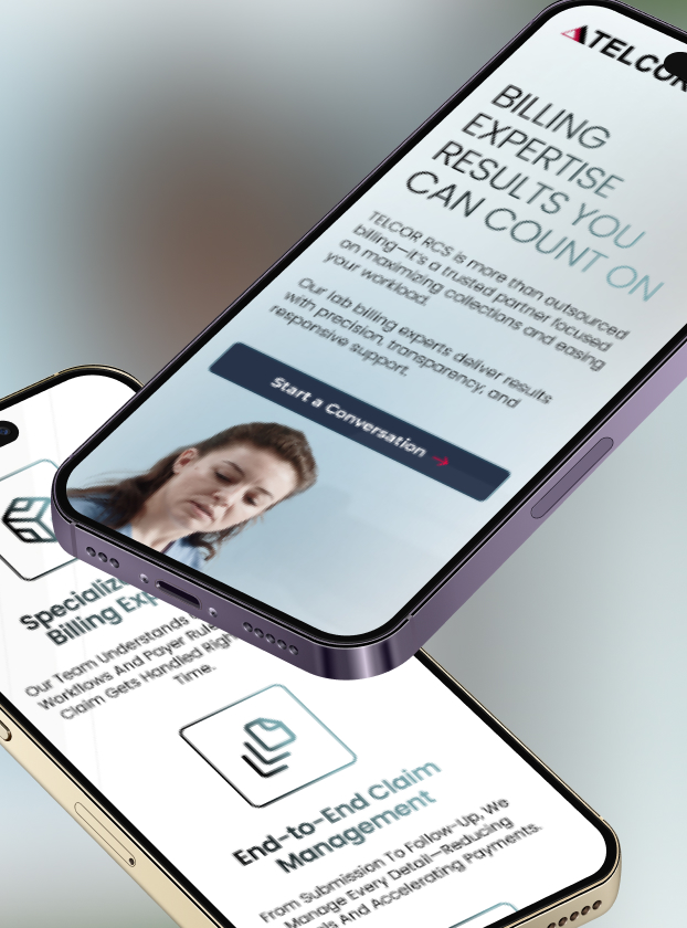
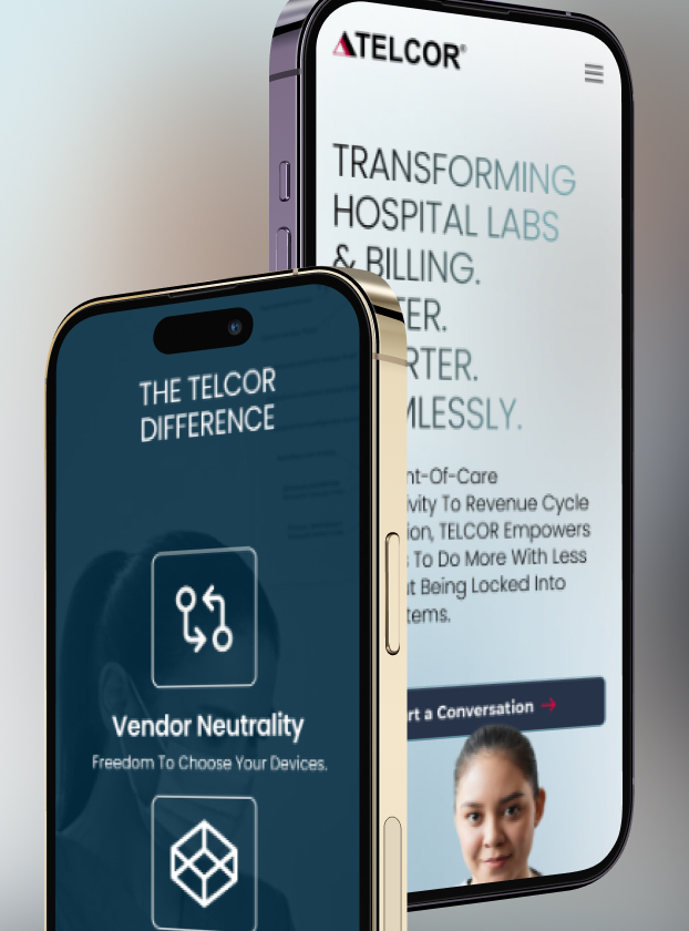
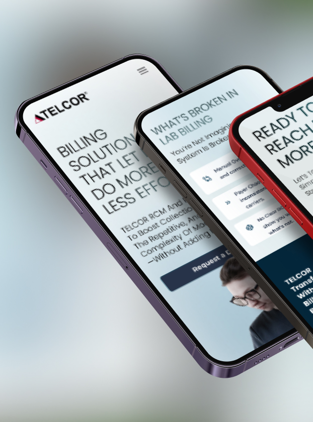
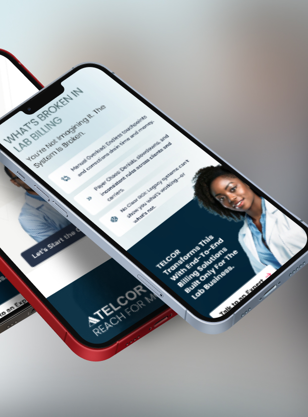
Multi-page demo requests became inline forms and slide-in CTAs, and the desktop-first experience was rebuilt mobile-first with progressive disclosure, floating bottom CTAs, and scrollable storytelling, closing the gap on a mobile traffic share that had been sitting at 19% against a 30-50% industry benchmark. This is the same methodology behind every Revenue Website Sprint: start with research, move to focused recommendations, then execute with intention. Same rigor, different scope depending on budget and timeline.