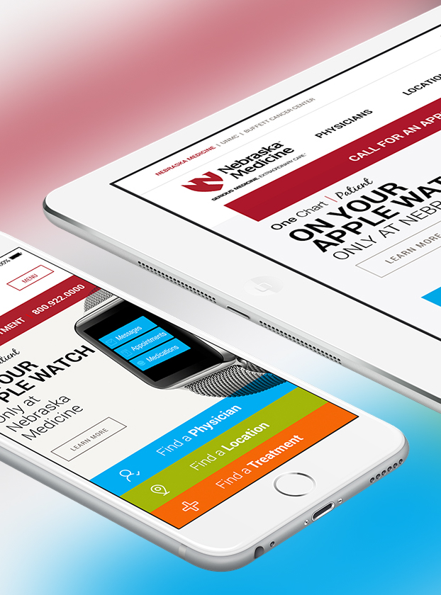
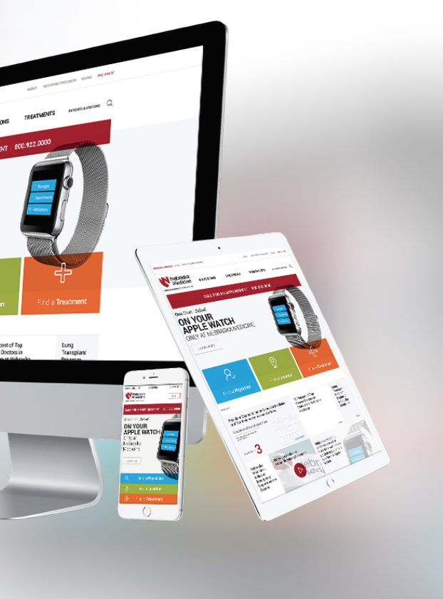
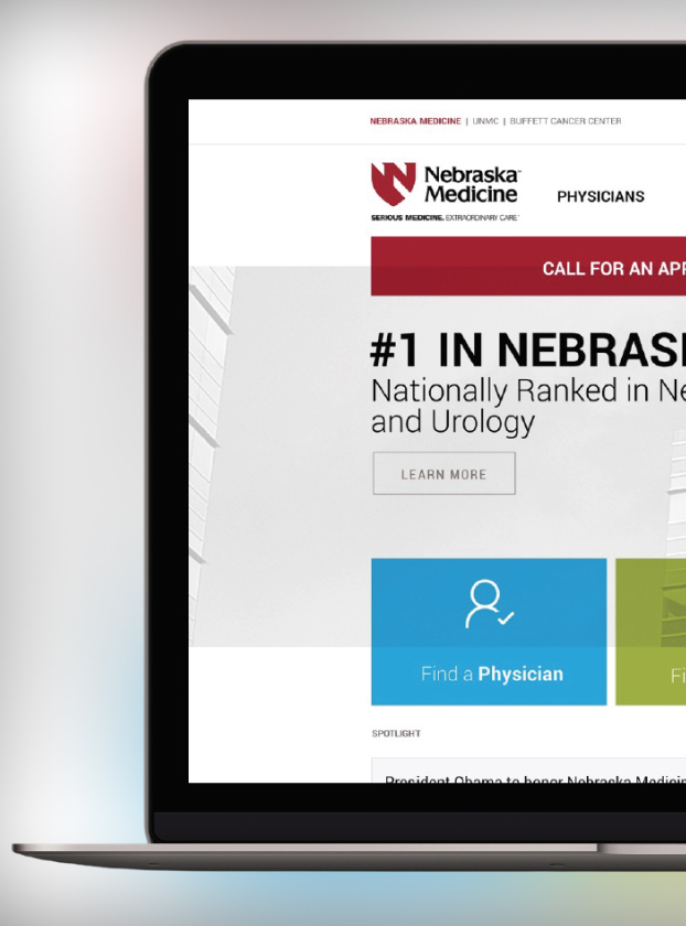
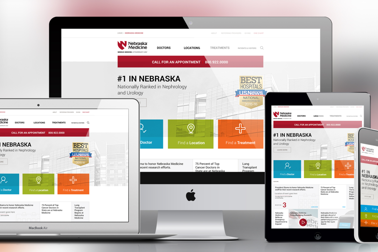
Nebraska Medicine's website had grown into exactly what patients don't need in a moment of stress: a maze. I led the redesign in partnership with DAAKE, rebuilding the experience around what patients were actually trying to do instead of how the organization was structured internally.
Patients and visitors were struggling to navigate the site's convoluted structure. Essential healthcare information and services were buried under layers of content, and the disconnect showed up as frustration, drop off, and missed opportunities to help people find care exactly when they needed it most.
Leading UX and interactive design in partnership with DAAKE, I threw out the assumption that the website should mirror the hospital system's internal org chart. I brought a content first approach instead: simplify the architecture, prioritize what patients actually search for, and let user research, not internal politics about whose department gets top billing in the navigation, decide what surfaces first.
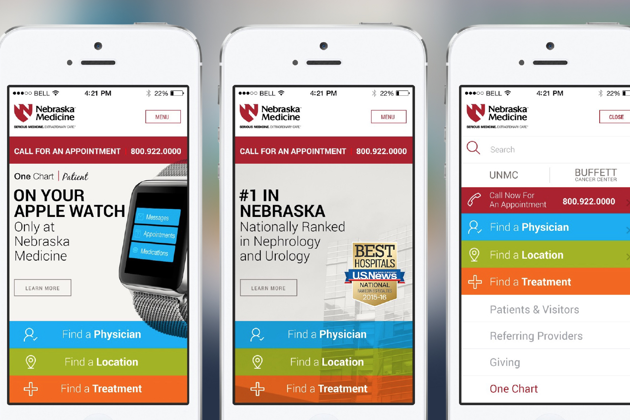
I rebuilt navigation around the real tasks patients arrive with: find a doctor, find a location, find a treatment, and promoted each one directly into the primary structure instead of leaving it buried three clicks deep. I redesigned search so it actually returns what people are looking for, and I treated every screen size, phone, tablet, and desktop, as its own first class experience rather than a scaled down afterthought. I laid out the thinking behind that strategy in a video walkthrough included in the gallery here.
What I brought to Nebraska Medicine was not a fresh coat of paint. It was a rebuilt front door, one built around the patient standing in front of it under pressure, not the org chart behind it. The result is a website people can actually use in a moment that matters: clearer paths to care, faster answers, and a digital experience that finally matches the seriousness of the medicine behind it.