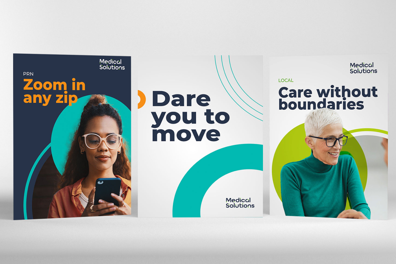
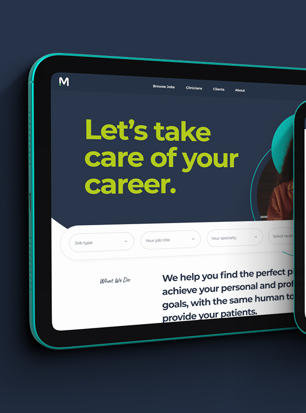
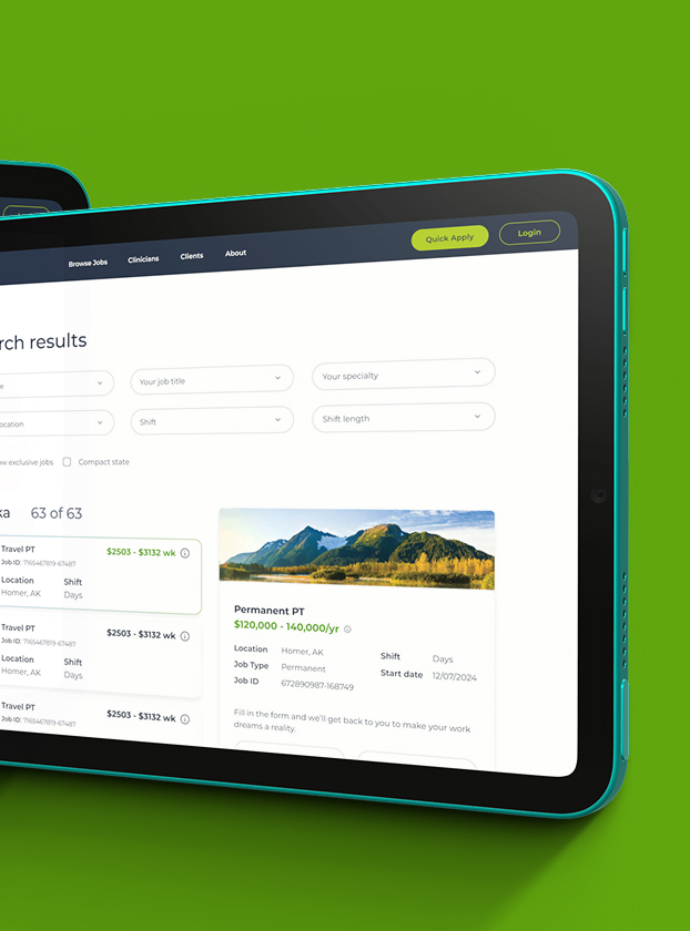
Years of acquisitions had left Medical Solutions speaking with a different voice under every legacy brand, right as leadership wanted one identity to carry the company into its next stage of growth. I led the rebrand and the enterprise design system built to unify that voice, one built to keep absorbing whatever the company acquired next.
Medical Solutions had grown into one of the largest healthcare staffing firms in the country largely through acquisition: On Assignment and its strike-response service NurseBridge in 2014, PPR Travel Nursing and 360 Healthcare in 2018, and C&A Industries, parent to a family of specialty staffing brands, in 2019. Each acquisition solved a real business need on its own. None of them arrived speaking the same visual or verbal language. A clinician or a facility could meet Medical Solutions online, on assignment, or at a conference booth and encounter a different voice each time, right as leadership wanted one confident identity to carry the company into its next stage of growth.
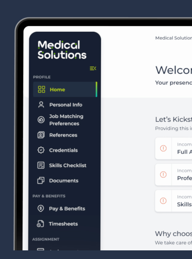
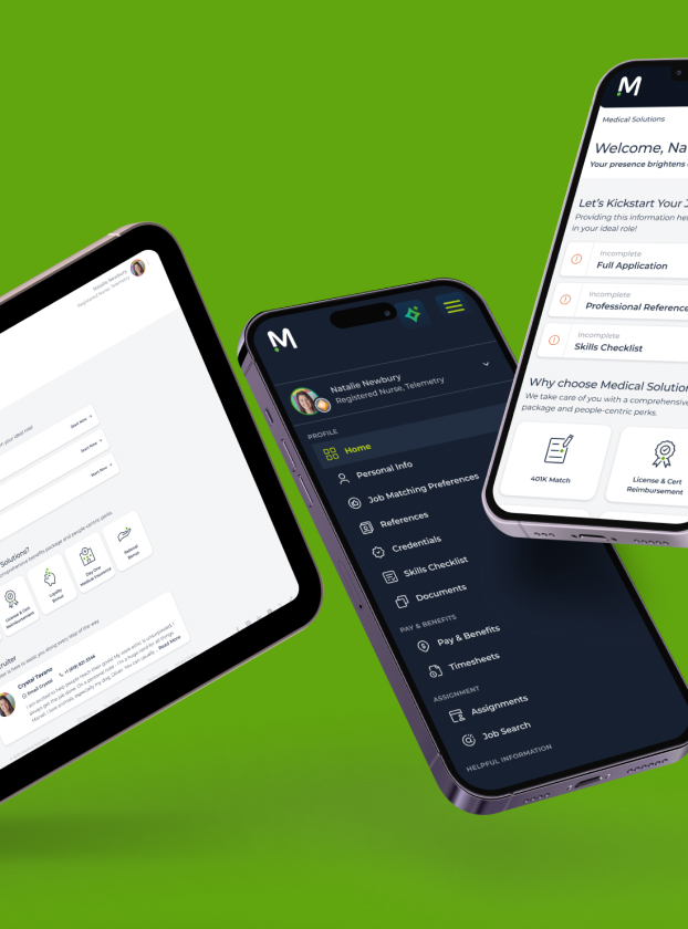
I led the rebrand and the corporate website redesign built to solve that: a brand and design system flexible enough to hold together a company built from acquisition, and a website, job search, and clinician portal that carried it into the actual experience thousands of clinicians and facilities use every day. PPR sunset its own brand into Medical Solutions in 2021, folding into the identity my team and I built rather than adding one more voice to reconcile.
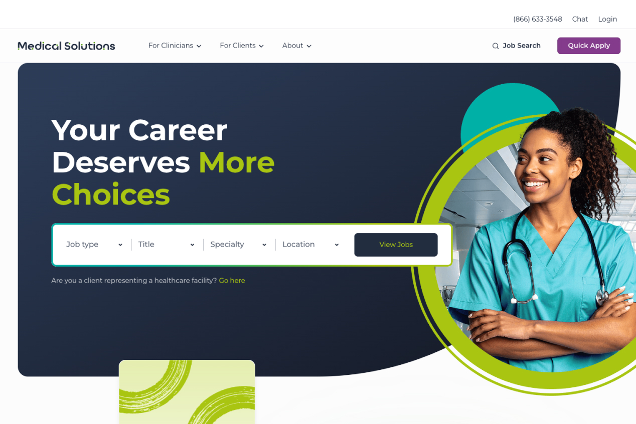
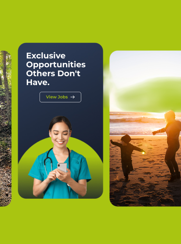
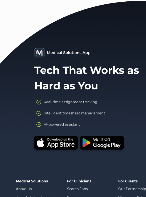
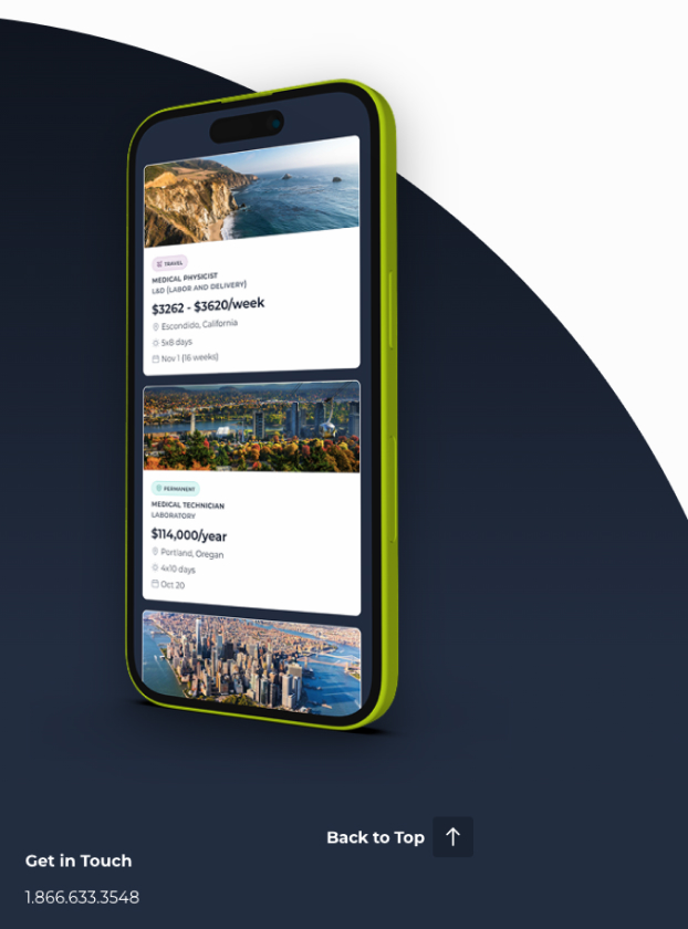
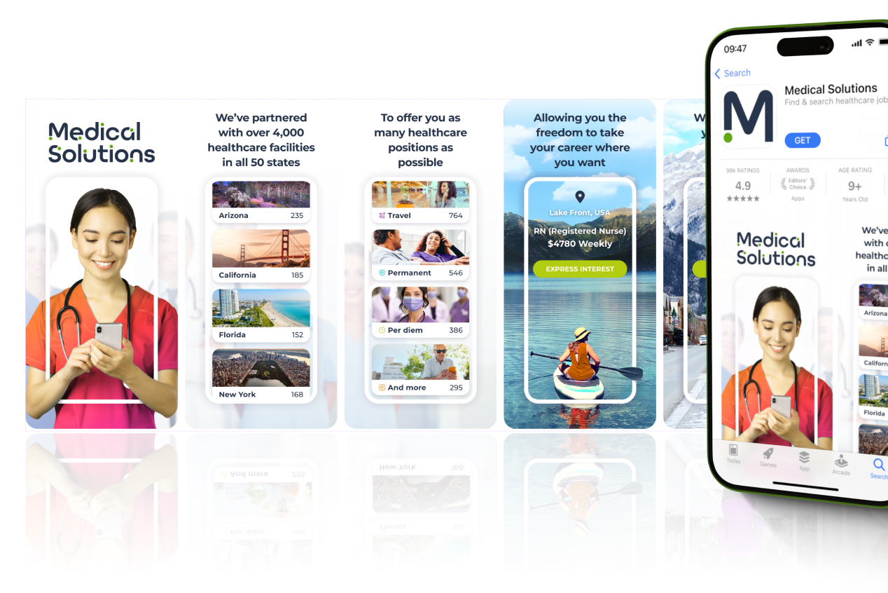
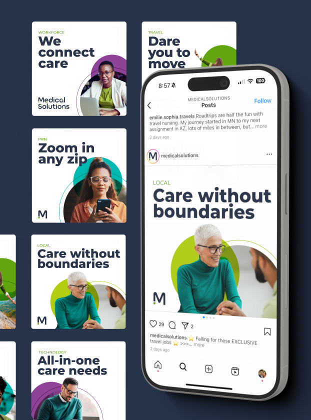
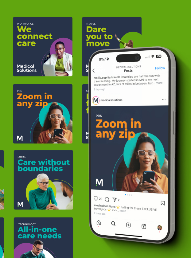
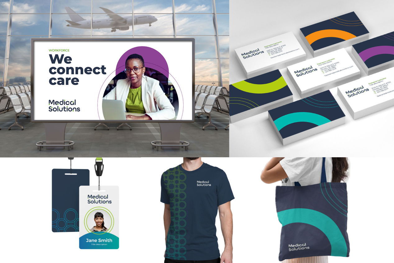
The redesign turned Your Career Deserves More Choices into more than a headline: a job search built for speed, a clinician portal that keeps travelers and recruiters aligned on assignments and credentials, and workforce tools built with technology partner ciro to keep staffing coverage ahead of demand. The same type, color, and iconography system carried across web, portal, campaign, social, and physical collateral, an airport billboard, business cards, ID badges, apparel, and tote bags, so the brand read as one company wherever a clinician or a facility encountered it.
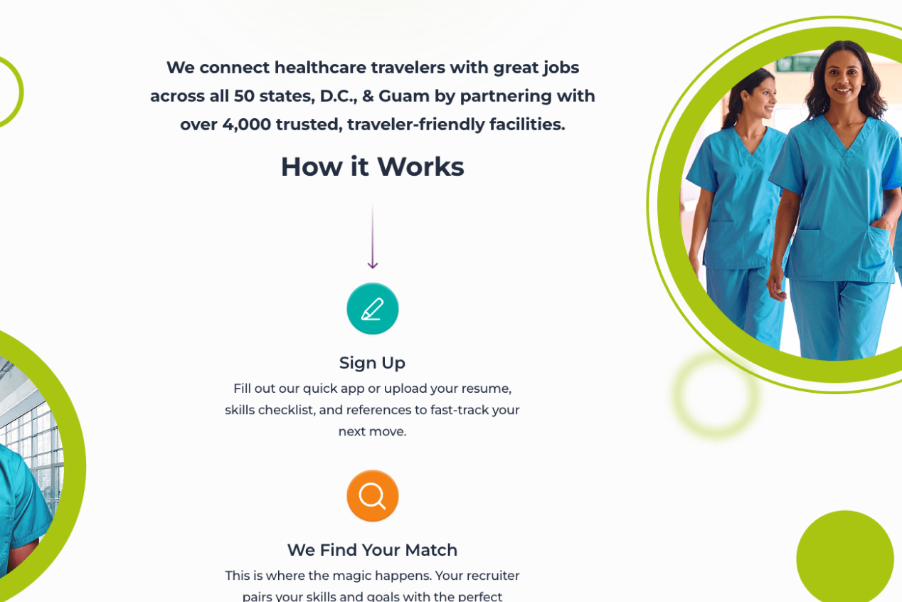
Under my design leadership, job apply conversion on the redesigned job board climbed from 2.6% to a sustained 6%+, more than doubling the rate at which visitors became applicants. That lift sits inside a network running at serious scale: more than 4,000 partner facilities across all 50 states, D.C., and Guam, over 52,000 clinicians placed annually, a 350+ affiliate network, and a 95% client satisfaction rating, the scale of company the brand and website had to represent, even where the work here isn't the sole cause of every one of those numbers.
The system proved itself past the point I built it. Medical Solutions kept growing after this work shipped, adding HOST Healthcare, Matchwell, and WorldWide HealthStaff Solutions to the family in 2022 and 2023, and the identity held: a brand and design system built to keep absorbing new acquisitions without needing to be rebuilt each time. That's the case I made for investing in a system instead of a one-time look. A fast-acquiring company needed a brand its next deal could fold into, not one it would outgrow again.
What Medical Solutions needed from this rebrand was never just a new logo. It needed one confident, consistent voice sturdy enough to follow a clinician from the first job search to every day on assignment, and flexible enough to keep absorbing whatever the company acquired next. That's the standard the system was built to, and the one it's still meeting today.