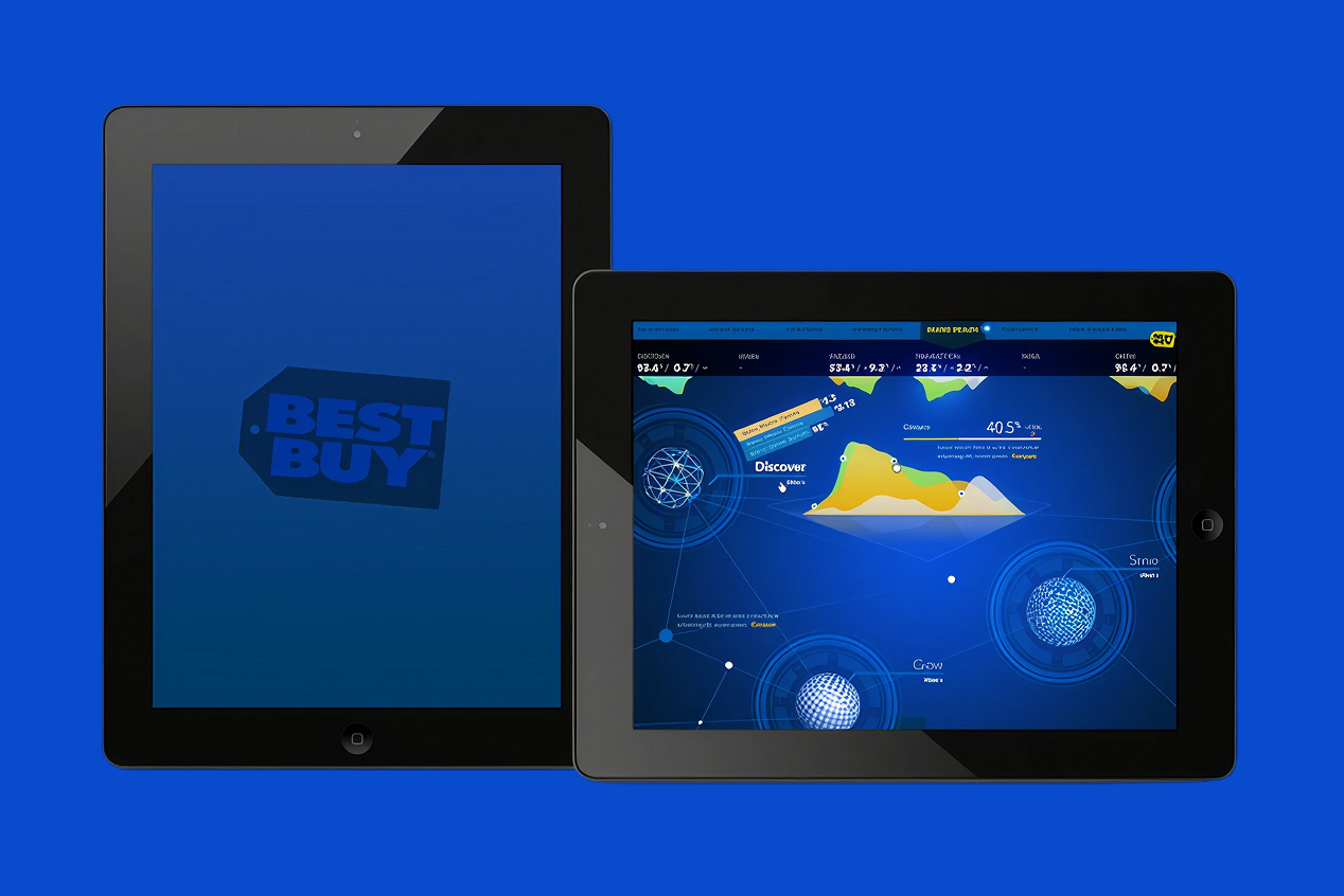
Best Buy's marketing team was running brand health, engagement, and campaign performance through an internal tool that made the numbers hard to see. The redesign brought bespoke visualization and a clearer information hierarchy to a dashboard used every day.
Best Buy sought a user-friendly and visually appealing overhaul of its internal marketing interface.
The project involved bespoke designs and concepts built specifically around how the marketing team actually worked, not a generic dashboard template retrofitted with Best Buy's brand colors.
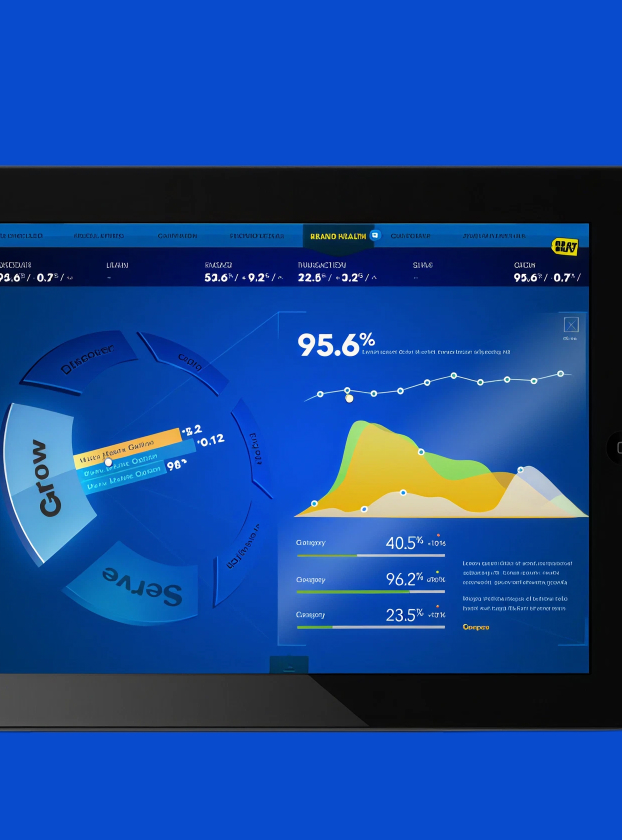
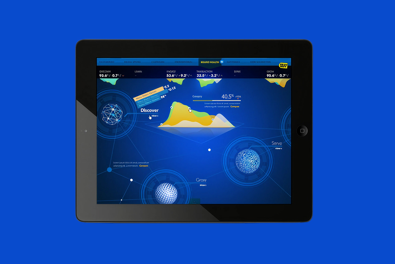
Brand health metrics like discover, learn, engage, transaction, serve, and grow needed to be scannable at a glance, so the interface leaned on custom data visualization rather than dense tables of numbers.
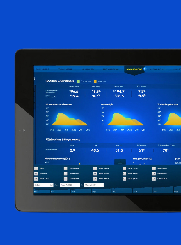
Reward Zone attach rates, redemption trends, and cart multiples got the same treatment: charts built to surface the trend first and the precise figure second, matching how a marketing lead actually reads performance data.
The result met the team's functional reporting needs while raising the bar on the day-to-day experience of using an internal tool, treating an operational dashboard with the same design rigor as a customer-facing product.